Brand Identity · Visual System · Packaging · Spatial Design
Conceptkyo
A concept identity for a modern apothecary where botanical tradition, hand-blended remedies, and the quiet ritual of self-tending converge.
Discovery and Foundation
kyo began as a visual exploration of a question: what does it look like when a brand treats self-care as something quiet, intentional, and rooted in tradition rather than trend? The concept draws from apothecary culture, herbalism, and the aesthetic intersection of dark academia and cottage botanica.
The name itself (kyo, from the Japanese word for "today") anchors the brand in presence and daily ritual. Not aspiration, not performance. Just the practice of tending to yourself with the same care you would tend to a garden.
The Mood
The Pinterest board that seeded this concept told a clear story: antique books with botanical illustrations, dried herbs and mortar-and-pestle work surfaces, warm amber light through lace curtains, tea-stained parchment, and deep forest green as the dominant color thread. The visual language is rich without being heavy, layered without being cluttered.
The Fictional Client
kyo is imagined as a small-batch apothecary producing herbal teas, tinctures, salves, and ritual blends. The shop operates from a brick-and-mortar space that feels like stepping into an old-world herbalist studio: wooden shelves lined with glass vessels, handwritten labels, and the scent of dried lavender and cedarwood.
Creative Direction
With the mood established, we built a creative direction framework covering tone, color, typography, and symbolic language. This is the phase where alignment gets confirmed before any design work begins.
Tonal Framework
kyo speaks in a voice that is knowledgeable but never clinical, warm but never precious, grounded but never dull. The tone mirrors an herbalist who has studied their craft deeply and shares it with quiet confidence. Copy should feel like reading a handwritten note, not a product label.
Color Strategy
The palette centers on deep forest green (#2C3527) as the primary tone, supported by parchment cream (#F5F0E8), dried rose (#8B5E5E), burnt amber (#9A6B3C), and charcoal (#2A2A2A). These are not "branding colors" in the corporate sense. They are the colors that naturally emerge from the world kyo inhabits: the green of pressed herbs, the cream of aged paper, the rose of dried petals, the amber of tincture bottles.
Typographic Direction
The logotype uses a bespoke hand-drawn script that feels like calligraphy done with a botanical illustrator's hand. Supporting typography pairs a refined serif (for headers and labels) with a clean humanist sans-serif (for body text and product information). The system should feel handcrafted at the top level and legible at the detail level.
Symbolic Language
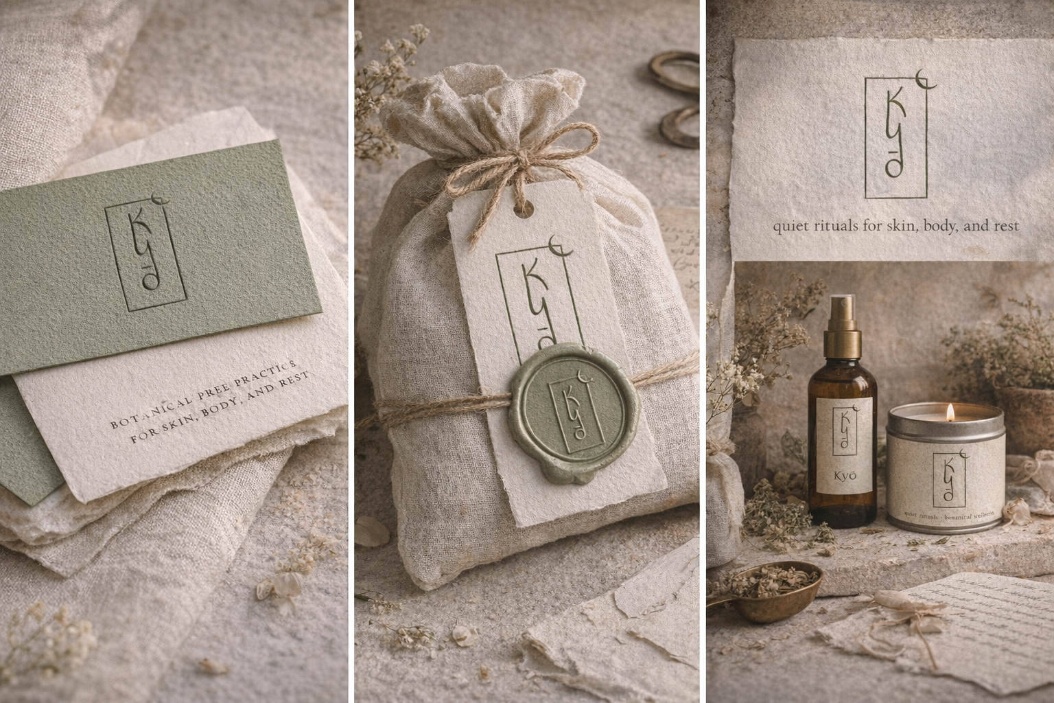
The primary mark features the "kyo" logotype within a rectangular frame, with a crescent moon breaking the upper-right corner. The rectangle grounds the brand in structure and craft. The moon introduces the celestial, the cyclical, and the feminine. Together they create a mark that reads as both a maker's stamp and a tarot-adjacent symbol.
Design Development
With direction locked, we developed the full identity system. Every element was designed to feel like it belongs in the same room: the same shop, the same shelf, the same world.
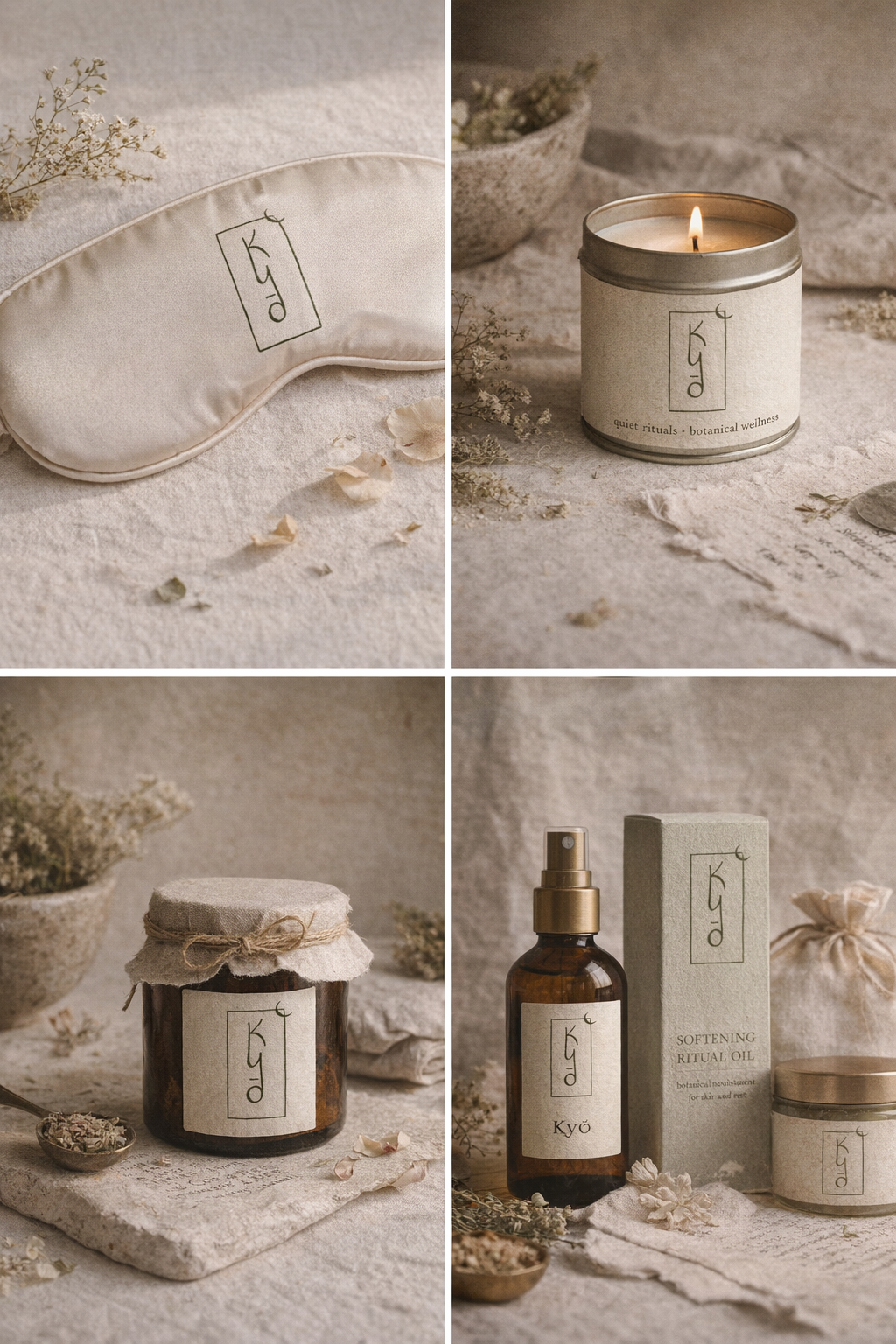
Logo System
The primary mark (logotype in frame with crescent) anchors the brand. A secondary wordmark without the frame works for smaller applications. A standalone crescent moon serves as a brand icon for digital use, packaging seals, and wax stamps. All three versions were tested across dark and light backgrounds to ensure the system holds.
Packaging Concept
Glass vessels with handwritten-style labels on textured parchment stock. Amber bottles for tinctures, dark green glass for dried blends, clear glass for bath salts. Each label carries the kyo mark, product name in serif type, and botanical ingredients listed in a quiet, understated hierarchy. The packaging should feel like something you keep on a shelf, not something you throw away.
Stationery Suite
Business cards, thank-you inserts, and shipping labels all rendered on uncoated cream stock with deep green ink. The tactile quality matters as much as the visual: the paper should feel substantial, slightly rough, like something pressed rather than printed.
Spatial Concept
The shop interior was designed as part of the brand world: dark green walls, wooden shelving, brass fixtures, hanging dried herbs, candlelight, and vintage botanical prints. The space functions as a brand touchpoint. Walking into kyo should feel like entering the brand itself.
Identity applications designed for kyo
Refinement and Delivery
As a concept project, refinement focused on ensuring every element cohered into a single, believable world. The test was simple: could someone encounter any single piece of this brand and immediately understand the full picture?
System Coherence
Every touchpoint was evaluated against the tonal framework. If a design element felt too polished, too corporate, or too trendy, it was revised or removed. The system had to feel handmade, considered, and timeless.
The Concept Package
The final concept delivery includes the complete logo suite, color specifications, typography standards, packaging mockups, stationery designs, spatial concept renders, and a brand narrative document that explains the world kyo lives in.
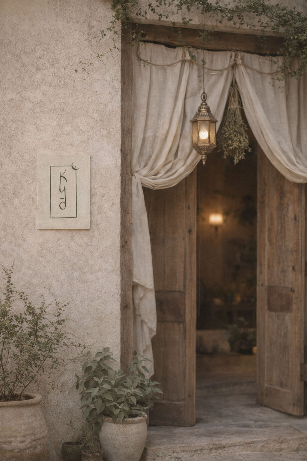
Brand world concept for kyo
The Outcome
kyo exists as proof that brand identity work can begin from nothing but a mood, a question, and a visual instinct. The concept demonstrates the full Hanami Studios process applied to an imagined client: from discovery through direction, design, and delivery. It shows how a brand can feel like a place you have already been, even if it has never existed.
Deliverables
What we handed off
Want something like this?
Every project begins with a conversation. Let's explore what your brand needs.
Start a Project