Brand Identity · Strategy · Visual System · Web Design
Nose for Success
A structured identity system for a results-driven dog training business ready to command premium positioning.
Discovery and Foundation
The engagement began with a detailed brand questionnaire designed to surface the intellectual and emotional core of Nose for Success. The founder articulated a clear vision: discipline, trust, growth, and the dog-owner partnership as a team. The business serves dog owners who want expert-level training with measurable results, not cute tricks, but structured behavioral development.
Through this discovery phase, we identified a critical gap: the pet training industry defaults to playful, cartoon-forward branding that actively undermines perceived expertise. Nose for Success needed to look and feel like what it is: a serious, results-driven training provider.
What We Uncovered
The founder's voice pillars (guiding, empowering, celebratory) gave us a clear tonal framework. The brand needed to feel like a coach: professional and trustworthy, encouraging and supportive, sophisticated but never complicated. Every design decision would connect back to the dog-owner bond and the transformation that structured training creates.
Creative Direction
With the foundation established, we developed a curated creative direction encompassing tonal guidance, aesthetic references, typography exploration, and color strategy. This phase is where we confirm alignment before any formal design development begins.
The Visual Tone
We proposed a direction rooted in restraint and authority. Deep maroon for strength and sophistication. Earth brown for groundedness. Sage green for growth and calm balance. Steel grey for professional neutrality. Warm beige to keep the system approachable without compromising its seriousness.
Typographic Direction
Serif typefaces for headers to convey timelessness and elegance, paired with clean sans-serif body text for readability across digital and print. The hierarchy was designed to carry the brand voice consistently: bold serif for primary headlines, regular serif for secondary, and sans-serif for everything else.
Symbolic Language
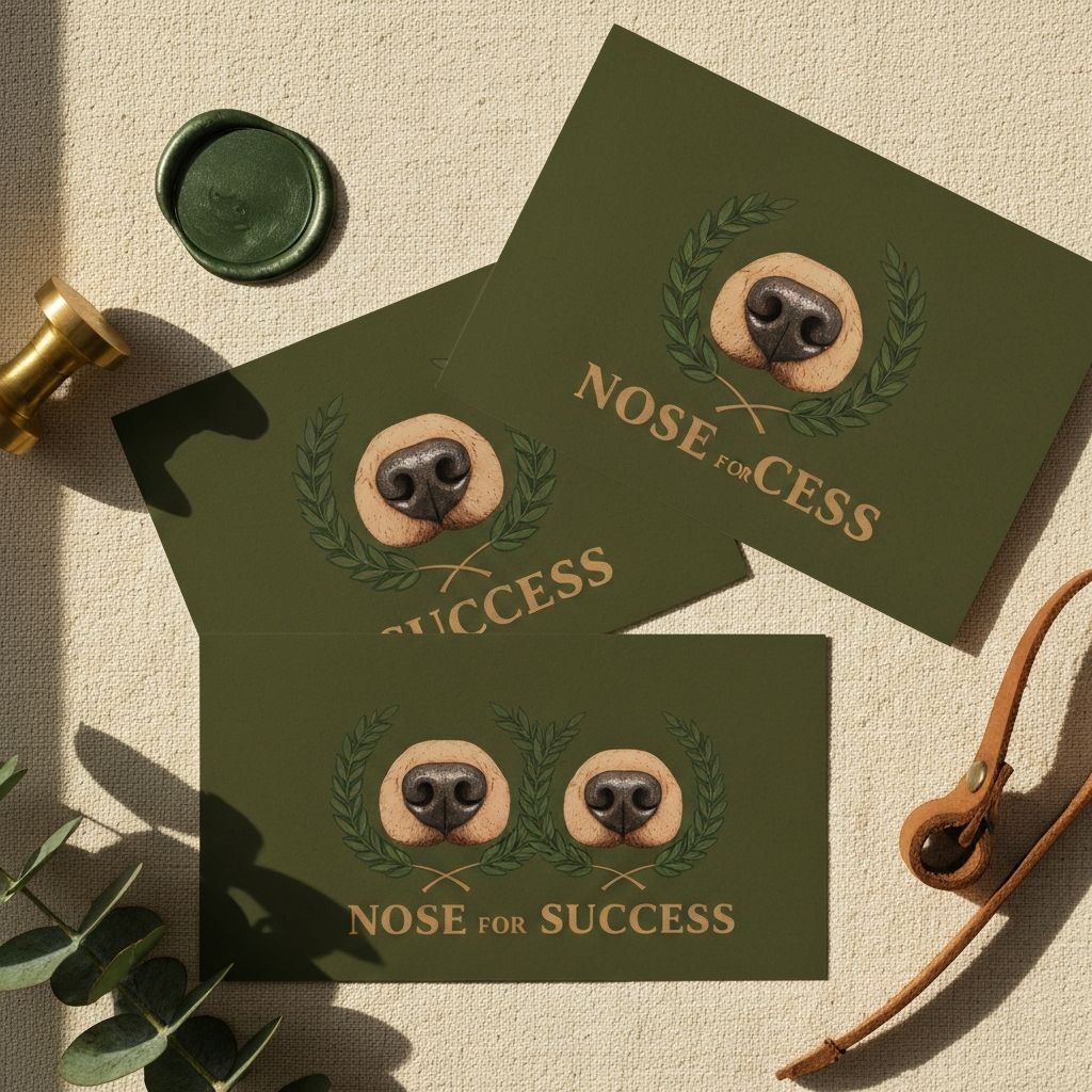
Rather than defaulting to paw prints or cartoon dogs, we proposed a refined nose print framed within a laurel wreath. The nose centering the brand on dogs, the laurel wreath communicating achievement and earned success. This mark carries recognition without resorting to industry cliches.
Design Development
With creative direction approved, we moved into full identity development. The visual system was presented as a complete, contextual whole, not fragmented elements, but a cohesive brand that shows how it lives in the world.
Logo Architecture
Three versions of the mark were developed: a primary logo with the nose-and-laurel emblem and full brand name, a simplified secondary mark for compact applications, and a circular seal version for badges and stamps. Each was built to function across every context, from digital headers to embroidered training gear.
Color System
The palette was finalized with primary tones of deep maroon, earth brown, and steel grey, supported by sage green and slate blue as secondary accents, all grounded by a warm beige neutral base. The palette deliberately avoids the bright, saturated colors common in pet industry branding, opting instead for tones that reinforce trust, discipline, and calm confidence.
Typography System
Merriweather and Libre Baskerville for headers, Lato and Source Sans Pro for body text. The scale was tuned for hierarchy: H1 in bold serif, H2 in regular serif, body in clean sans-serif, creating a reading experience that feels authoritative without being heavy.
Collateral and Applications
The identity was extended across business cards, marketing flyers, social media templates, email design, and promotional graphics. A vintage newspaper-style flyer was developed to announce the business launch, combining editorial sophistication with the warmth of the brand voice. Business cards were designed with the logo centered on a deep maroon background, with contact information on a warm beige reverse.

Identity applications designed for Nose for Success
Refinement and Delivery
Two structured revision rounds refined the system based on consolidated client feedback. Final files were organized and delivered in clearly labeled formats for immediate use across all touchpoints.
The Delivered System
The final delivery included the complete logo suite, color specifications, typography standards, brand guidelines document, business card designs, marketing flyers, social media templates, and visual alignment notes. Every element was designed to work together as a unified system.
The Outcome
The resulting brand positions Nose for Success as a structured, results-driven training provider capable of commanding premium pricing. The cohesive system, from logo to marketing collateral, communicates a level of professionalism that matches the quality of the training itself. The identity bridges the gap between approachability and authority, proving that serious work deserves a serious visual presence.
Deliverables
What we handed off
“Working with Alexis was truly an amazing experience. Before meeting her, I struggled to find a logo and brand identity that felt right for a high-risk, highly professional industry. From the start, she brought so much clarity and relief to the process. She took the time to truly understand my vision, welcomed feedback, and refined every detail until it felt perfect.”
Founder, Nose for Success
Want something like this?
Every project begins with a conversation. Let's explore what your brand needs.
Start a Project